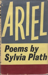
Let us now praise Berthold Wolpe (1905 - 1989).
There have never been better-looking dust wrappers (or jackets, as collectors apparently call them), than those he designed for the publishers Faber and Faber - over 1,500 covers between 1941 and 1975. Bold and simple, they stand out a mile. Wolpe wasn't alone - Faber employed a wonderful cohort of artists including Edward Bawden, Barnett Freedman, David Jones, Charles Mozley and Rex Whistler. But it is Wolpe's designs that dazzled, and which did most to establish the distinctive look of Faber's books for over thirty years.
We'll start with a favourite writer, a remarkable book and an absolutely perfect design:
We'll start with a favourite writer, a remarkable book and an absolutely perfect design:
Wolpe's Alexandria Quartet designs are among his best. I get the impression that Durrell isn't much read these days. I've yet to meet anyone who has read the excellent two-volume novel sequence Tunc and Numquam.
Two very different poets from the mighty Faber list get the Wolpe treatment:
This cover - for Robert Lowell's best collection - uses Wolpe's elegant Albertus typeface (which can be seen on street signs throughout the City of London).
The rippling waves and marine colouring of Pincher Martin reflect the Icarus myth of the content. We seem no longer to employ 'by' or 'a novel by' on book covers. I expect in this case it was to disambiguate the novel's title and the author's name.
The first grown-up poetry book I bought was Ted Hughes's Wodwo (above) and ever since then the acquisition of a complete set of Wolpe-designed Faber poetry volumes has been one of my 'thin continuous dreams' (as Larkin put it). Here's his under-rated novel, and another striking Wolpe design:
Not all authors admired the Faber style. Lawrence Durrell wrote to Wolpe in 1961 to complain about the cover for his 1947 novel The Dark Labyrinth:
Dear Mr Wolpe,
It was good of you to send the cover mock-up. But what am I to tell you honestly? It seems to me
beyond words horrible; and yet this is offensive to say to an artist of experience like yourself. This
dreadful puce! And I really think that two drunken snails dipped in permanganate could have produced more aesthetically pleasing shapes…
Judge for yourself:
Here's a good article about Wolpe: http://www.thethoughtfox.co.uk/?p=5442
All images © Faber and Faber and the Estate of Berthold Wolpe


No comments:
Post a Comment